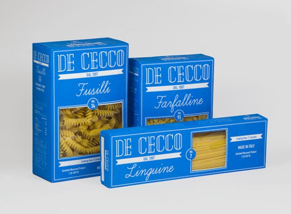
Food Packaging
In Canada, the law on food labeling is extensive and includes documents from legislation to regulations. These documents all work together to ensure that there is a minimum standard of living within Canadian society and to promote food safety. Because everyone needs food to survive, it is important that society be able to trust their governments to ensure manufacturers co-operate with food laws and regulations. This ensures that every individual has access to information regarding what is in their food and the ability to choose which foods they want to fuel their bodies with. “Federal responsibility for development of Canadian food labeling requirements is shared among two federal departments, Health Canada and the Canadian Food Inspection Agency” (CFIA), both of which rely on each other to ensure the health and safety of the public. According to the Canadian Food Inspection Agency, a food label serves three primary functions:
- it provides basic product information (including common name, list of ingredients, net quantity, durable life date, grade/quality, country of origin and name and address of manufacturer, dealer or importer)
- it provides health, safety, and nutrition information. This includes instructions for safe storage and handling, nutrition information such as the quantity of fats, proteins, carbohydrates, vitamins and minerals present per serving of stated size of the food (in the Nutrition Facts table), and specific information on products for special dietary use
3. it acts as a vehicle for food marketing, promotion and advertising (via label vignettes, promotional information and label claims such as low fat, cholesterol-free, high source of fibre, product of Canada, natural, organic, no preservatives added, and so on).

6 rules for packaging design that will shine on the shelf
The average supermarket in Canada holds around 40,000 different items. This nearly $600 billion industry relies heavily on consumers, distributors, manufacturers and… graphic designers.
So let’s see what makes and breaks good packaging design.
1. Clarity and simplicity
Next time you go to a supermarket, pick a random shelf and browse through some products. Glance at each and ask yourself two very simple questions:
You will be amazed how hard it is to find answers to some of these essential questions in less than 4 seconds, which is the maximum time average consumer will dedicate to any particular product on the shelf.
You’ll find products listing dozen of benefits with no clear brand name. You’ll find products that look great on the outside yet fail to explain what’s in the box. You might even find cleaning products in packaging more appropriate for kids juices.

This is a BAD example of a package design! This cleaning-product looks dangerously tasty, don’t you think? This packaging design might confuse consumers and fail to deliver on clarity.
Although some product categories allow for a bit of mystery (think perfumes and luxuries), failing to identify the product in terms of content, usage or brand identity is a horrible practice which usually results in a packaging design which doesn’t perform well in stores.
So remember rule number one: be clear about the product, be clear about the brand.
2. Honesty
Beginners in packaging design, and I’m talking both clients and designers, often strive to depict the product in the most perfect way imaginable. They will show a cookie drenched in chocolate, when in fact you’re buying a simple chocolate flavored biscuit. They’ll show rich, fresh cherries on fruit yogurt with little fruit content.
By depicting a product ten times better than it actually is, you’re misleading and ultimately disappointing the consumer, which only leads to poor sales performance and very bad brand image.

This product might taste good, but the packaging is clearly misleading.
This is where honesty comes in. Consumers have nothing against simple, inexpensive products, as long as they know what they’re buying! Of course they expect “face lifting” to some degree but not to a point where product appears to be something entirely different.
3. Authenticity
Originality, character and memorability are at the heart of great brands and of course, great packaging designs.
It’s easy to understand why . . . there are hundreds of products out there, all competing for consumers’ attention. The only way to set your brand apart is to be different, to be authentic.

This packaging design from Colin Porter Bell is a great example of authentic and memorable packaging design.
If you’re stuck with a generic looking packaging design then apply an uncommon design style with strong “visual standards.”
For example, if everybody is going for product photography, use illustration or type-based design. If everybody is using a horizontal layout, reach for vertical. If most designs are rather contemporary, try introducing something retro with focus on quality appeal.
4. Shelf impact
From a shopper’s point of view, a product is never seen alone and never in great detail. Because of the viewing distance from shelves and the fact that products are arranged in rows and columns, all we see are veritable patterns made of various products. It’s not until a certain pattern attracts our attention that we decide to take a closer look.
This distinctiveness and appeal of the product when placed on an actual shelf is something retailers call “shelf impact,” and it makes a huge difference in product sales.
Shelf impact is something you need to test and explore in your designs. You can do this by imitating the placement of your design on an actual shelf and surround it by other products (for best results, use several rows and columns of each product). The more distinctive it looks, the better it sells.
Note: you will be amazed at the results – sometimes the best looking design will simply blend in and become invisible, while more simple designs “pop” in this environment.
5. Extensibility
A product packaging design concept should allow for an easy introduction of a new line extension (product variation) or a sub-brand.
For example, imagine you’re creating a packaging for new brand of apple juice. You and your client opt for a certain design featuring apples which looks really great. However, a few months later, the client decides to launch a cherry flavor under the same brand name.

Good packaging design allows for easy variations without loosing visual appeal.
To your dismay, you understand that the initial design concept you created heavily relies on apples to work and that cherries will not look nearly as good. Plus, cherries have some benefits to be communicated on the front panel, which works against your idea. You have a problem with extensibility.
To avoid this, you should always design product packaging with the future in mind. This means creating a visually systematic design which allows for easy changes of product visual or other information, so you get a fine looking family of products in the end.
6. Practicality
Practicality deals with the actual shape, size and functionality of the product container, not just the label or wrap. The more practical the product, the more sales it gets . . . when Heinz turned the ketchup bottle upside down, sales skyrocketed

Practicality is the most overlooked aspect of packaging design, simply because clients often pick the “tried and true” route which is a lost opportunity for innovation.
Practicality alone can solve many of the packaging design challenges
Fat free and 100% Natural: Seven Food Labeling Tricks Exposed
If you’re confused by food labels, you’re not alone. But don’t hold your breath for an at-a-glance food labeling system that tells you how much salt, fat and sugar each product contains. Marketers use a variety of tricks to make foods seem healthier and more appealing than their competitors, particularly when it comes to products aimed at children. One of the most powerful advertising tools a food manufacturer has is the packaging, as it’s what we look at immediately before deciding which food to purchase.
Next time you’re shopping for food, look out for these seven common labeling tricks:
- Colour
The colour of food packaging can influence our perceptions of how healthy a food is. A recent study found consumers’ perceptions of two identical chocolate bars were influenced by the colour of the nutrition label; despite the identical calorie information, people perceived the one with the green label to be healthier.

- Ticks and Seals
Another tool of savvy food marketers is the use of “ticks” and “seals” that we subconsciously process as indicating that the product has met some form of certification criteria.
A recent study found that nutrition seals on unhealthy food products increased perceptions of healthiness among restrained eaters. And a study with parents of toddlers found 20% of parents identified the presence of a quality seal as one of the reasons for their purchase of toddler formula rather than cow’s milk.
- Weasel Words
Food packaging often contains words that imply the food contains certain ingredients, or has been prepared in a way, that makes it healthier (or at least better than similar foods).
But many of the words – such as “healthy” or “natural” – have no legal or formal meaning. While the Canadianregulates the use of specific health and nutrient content claims, it doesn’t regulate or define these loose terms.
“Weasel claims” describe modifiers that contradict the claims that follow them. This allows manufacturers to avoid allegations of breaching advertising or labeling regulations, while being such a commonly used word that it is overlooked by the consumer.
For example, Activia “can” help to reduce digestive discomfort - but did you read the fine print? It “can” help if you eat it twice a day and “… as part of a balanced diet and healthy lifestyle”.
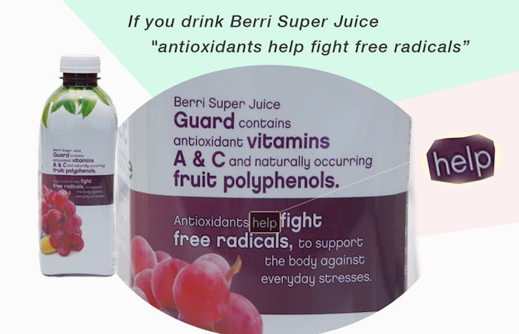
Similarly, Berri Super Juice contains antioxidants which “help” fight free radicals (but so does whole fruit, which also contains more fibre).
- Less bad stuff than . . .
Unfinished claims tell us the product is better than something . . . but not better than what? In food labeling, we really have to hunt for the “what”.
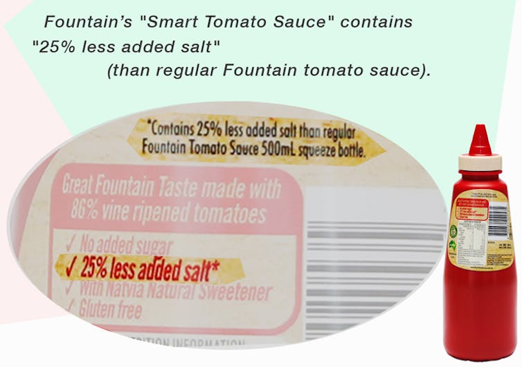
Fountain’s Smart Tomato Sauce still contains 114mg of salt per serving, while the brand’s regular tomato sauce contains 186mg (more than several other brands).
The Heart Foundation defines low-salt foods as those with less than 120mg per 100g; Fountain’s Smart tomato sauce has 410mg per 100ml. It does, however, have less sugar than many of its competitors.
So, if you are trying to reduce your sugar intake it may be a good choice, but if you are trying to reduce your sodium intake, look for one of the low-salt varieties and read the label very carefully (reduced is rarely equals low).
Smiths’ Thinly Cut potato chips contain 75% less fat than “chips cooked in 100% Palmolein Oil”. But they don’t contain less fat than Original Thins, Kettle, or most other brands on the market.
It’s also worth taking a close look at the recommended serving size – in both cases the nutrition information is based on a 27g serving, but Smiths’ “single serve” pack is 45g (15.7g fat; one-fifth of an average adult’s recommended daily intake, or RDI).
- Irrelevant Claims
A common strategy is to list a claim that is, in itself, completely true . . . but to list it in a way that suggests that this product is unique or unusual (when in reality it is no different to most foods in that category).
“All natural” and “no artificial colours and flavours” are appealing features for parents looking for snacks for their children. But most standard cheeses (including many packaged products such as cheese slices) also contain no artificial colours of flavours.
This is not to suggest that Bega Stringers are a bad product or that you shouldn’t buy them – just that you may want to think about the cost per serve compared to other cheeses that are equally healthy.

Like most gummy snakes, Starburst snakes are “99% fat free”. The old adage of “salt-sugar-fat” holds here; products that are low (or absent) in one are typically very high in another. In the case of any gummy products, it’s sugar.
As with the potato chips above, serving size is important. Those of us who can’t resist more than one snake might be surprised to realize that if we ate half the bag, we would have consumed two-thirds of our daily sugar intake (although we can’t blame the pack labeling for that!).
No Added . .
Berri Super Juice proudly, and truthfully, claims it “contains no added sugar”. You may conclude from this that the sugar content is low, but a closer look at the nutrition information label may surprise you – a 200ml serve of this super juice contains 25.8g of sugar (29% of your recommended daily allowance).
- Healthy Brand Names
Healthy sounding words are not only used as “claims” but are often used as brand names.
Brand names are often seen as a key descriptor of the nature of the product. Research has found that people rate food as healthy or unhealthy based on pre-existing perceptions of the healthiness of a product category or descriptor, particularly among those who are watching their diet, and may thus select the unhealthier option based on its name or product category.

If, for example, you’re watching your weight, you may be attracted to the Go Natural Gluten Free Fruit & Nut Delight bar, assuming that it will be a healthier choice than a candy bar. But you might be surprised to note that it contains 932 kJ (11.0% of your Recommended daily amount) and a whopping 13.6g of fat (10% of your Recommended daily amount).
A 53g Mars bar contains slightly more calories (1020kJ) but a lot less fat (9.1g), although the Go Natural bar could argue for “healthier” fat given the 40% nut content.
So, can we really distinguish between healthy and unhealthy foods by looking at the wrappers? The healthiest wrappers are made by nature, from the simple ones that can be eaten after washing (like apples and carrots) to those that need some disposal (like a banana or a fresh corn cob).
If you are buying your food wrapped in plastic or paper, it’s a little more complex. We need to see past the colours, pictures and cleverly-crafted claims and take a careful look at the ingredients and nutrition panel.
Activity: Food Advertising Tricks
Shown below are examples of four food packages that are available in grocery stores in Canada. For EACH of the ads, discuss how the marketers have used advertising “tricks” to persuade us to buy the product and also WHY you think they used this trick . . . what audience are they appealing to, what are they trying to hide, does the “trick” work in your opinion.
|
Ad #1
|
Ad #2
|
|
Ad #3
|
Ad #4
|


